10.5.13
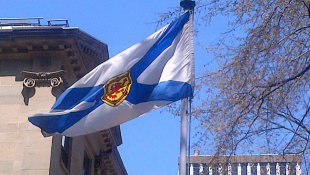
Después de 155 años, la bandera de Nueva Escocia es reconocida oficialmente
La provincia canadiense de Nueva Escocia ha aprobado oficialmente su bandera, que venía usándose desde 1858 sin sanción legal. Ha sido un niño de 11 años quien ha dado lugar a esta iniciativa, tras descubrir este vacío legal cuando estaba realizando un trabajo de clase y contactar con su representante parlamentario.
After waving for 155 years, Nova Scotia flag finally confirmed
By Nadine Kalinauskas
Nova Scotia's white and blue flag was first created in 1858.
It has never been officially recognized as the provincial flag until now, and it's all thanks to a young student.
Eleven-year-old Regan Parker, a student at Fanning Education Centre in Canso, Nova Scotia, was working on a heritage project when she learned that her province's 155-year-old flag had never been officially recognized. She contacted Jim Boudreau, her local MLA, who then sought the help of researchers at the Legislative library, CBC News reports.
"We checked with the executive council, leg library, Communications Nova Scotia, and so on, and in fact, it had never been recognized as the official flag," Boudreau said.
"I’ve always tried to encourage students to do independent research, to look at things and to, you know, not just take things at face value so this was, this was very nice to see happen," he added.
On Tuesday, Boudreau introduced a bill, the Provincial Flag Act, to confirm the flag as the official flag of Nova Scotia. The bill's third and final reading is set for today.
No word on the final grade for Parker's school project — but we're assuming she got an A.
Yahoo! News
4.5.13
La Marina canadiense adopta una nueva enseña naval
New Canadian Naval Ensign Adopted By Royal Canadian Navy
Defence Minister Peter MacKay announced the adoption of a new Canadian Naval Ensign to be worn by Her Majesty’s Canadian Ships, naval vessels, Naval Reserve Divisions, and other designated units starting on Sunday, May 5.
“The men and women of the Royal Canadian Navy can be proud to serve their country under this new Canadian Naval Ensign,” Vice-Admiral Paul Maddison, Commander Royal Canadian Navy said in a statement. “We are restoring the use of a standard Commonwealth practice, and an important symbol recognizing our rich naval heritage and the historical roots of the modern Royal Canadian Navy.” Photo of Ensign below courtesy of RCN:
From that point onward, the National Flag was adopted as both the Ensign and the Jack. In 1968, as part of efforts to emphasize the importance of military ensigns and flags, while also reflecting the new National Flag, a distinctive Naval Jack was adopted by the Canadian Armed Forces. The Naval Jack incorporated the Maple Leaf in the canton with a badge in the fly of the flag.
Today, the flag previously known as the Naval Jack is adopted as the new Canadian Naval Ensign, and the National Flag becomes the new Naval Jack, which mirrors a standard practice amongst Commonwealth nations. The change will most importantly distinguish Canadian warships from other Canadian flagged vessels. It will also promote and strengthen the Canadian naval identity, while underscoring the unique commitment of our men and women at sea who serve as members of the Canadian Forces in Royal Canadian Navy ships and vessels, according to the RCN release.
29.5.12
Una bandera asociada a la independencia de Terranova levanta controversias
Dos diputados del Nuevo Partido Democrático han decidido conceder la misma importancia a una bandera asociada a la independencia de Terranova que a la bandera oficial de la provincia, lo que ha suscitado controversias en la capital de Canadá.
Ottawa : un drapeau associé à l'indépendance de Terre-Neuve soulève la controverse
EXCLUSIF - Deux députés terre-neuviens du Nouveau Parti démocratique ont décidé d'accorder autant d'importance à un drapeau associé à l'indépendance de Terre-Neuve qu'au drapeau officiel de leur province d'origine, ce qui soulève la controverse à Ottawa.
Le rose-blanc-vert, symbole du nationalisme terre-neuvien, est pour le député Jack Harris un rappel des sentiments très forts des Terre-Neuviens envers leur culture et leur province. Pour son collègue Ryan Cleary, Terre-Neuve, avec ses ressources naturelles, est une « have province » qui n'a plus besoin des autres pour survivre.
Le ministre du Patrimoine canadien, James Moore, rappelle que le NPD « a dit qu'ils ont remplacé le Bloc québécois, comme une opposition officielle qui est fédéraliste. J'espère que c'est le cas ».
Le chef du NPD, Thomas Mulcair, n'a pas commenté l'affaire, disant vouloir faire ses propres vérifications au préalable.
D'après le reportage de Julien Lafille
Radio-Canada (imagen: Flags of the World)
Bandera de la guerra de 1812 está siendo restaurada
War of 1812 flag being restored
104th Regiment of Foot marched with flag from Fredericton to Kingston
The regiment consisted of men from the Maritime provinces and what was then Upper and Lower Canada.
"It's kind of almost like a Canadian regiment before there was a Canada,” said Gary Hughes, a curator of history and technology at the museum.
The regiment is in the history books for making the epic 1,100-kilometre trek during the winter of 1813 to help defend Canada from American invaders.
"It was a march that was conducted with the aid of snowshoes and toboggans,” said Hughes.
Historian Donald Graves edited the memoirs of Lt. John Le Couteur, who kept a journal throughout the 52-day trek between February and April, when temperatures dropped as low as -27C.
"You learn from the journals that it was a very difficult thing — going through snow waist-high, 800 men and their supplies, dragging their food on toboggans,” he said.
The regiment’s colour — a six-by-six foot silk banner and military symbol — is being refurbished in Halifax, thanks to an unknown donor.
The New Brunswick Museum's exhibit is slated to begin in December 2012, or January 2013, before the 200th anniversary of the historic march, and remain on display until the late fall of 2013.
The restored flag will be on permanent display at Saint John's Market Square following the museum's exhibition.
8.3.12
Duncan celebra su centenario con una nueva bandera
Duncan celebrates its 100th birthday with a new flag
Duncan celebrated its 100th birthday Sunday by unveiling a new flag.
But it may take a while to determine what city residents think of their new symbol designed by Duncan Councillor Sharon Jackson.
Besides the few hundred party-goers who attended the downtown centennial celebration, few people polled on the street Tuesday had seen the flag — which features Native salmon and a silhouette of city hall on a Vancouver Canucks blue-and-green background.
The process leading to the creation of the new flag had been on the receiving end of controversy after some accused the city of not consulting citizens enough in the decision-making process.
Geoffrey Chaster was one of the critics. He said the end product did nothing to change his mind.
Chaster said the symbols on the flag aren’t focused on the town of Duncan and he is disappointed the idea of including pioneers of the town was rejected early in the game.
“It’s all municipality, it’s a joke,” he said. “They (city hall) didn’t even try consulting the community. They didn’t do any research and they don’t give a damn,” he added, claiming most of the designs on the flag aren’t even in Duncan except for the clock tower.
“To me it’s just a bunch of dead fish on a rag. Sharon Jackson and city hall just don’t know what they’re doing.”
Few community members polled on the street felt as passionate as Chaster, however. Most were unaware Duncan was getting a new symbol, but were OK with the net result — calling it “nice,” “something new,” and “something different.”
“It’s nice that the city did this. I didn’t know anything about the controversy, but I think they did a good job representing the town,” said Jesse Lalond.
“I like the idea. It all fits together,” said Cowichan resident George Seward.
“It really shows what the town is and we’re lucky to be here. The flag has a little bit of everything,” Seward said as he gestured at the various elements of the flag.
Jackson was happy with the response.
She said the entire process entailed nearly 25 versions of the new flag and involved the guidance of the committee. She said the past four months have been very important in coming to a final design.
“The green represents the trees and mountains here in Cowichan. The blue represents the Cowichan River. You can see the silhouette of city hall in front of Mount Prevost,” said Jackson.
The five salmon are designed to represent the five original tribes of Cowichan: Koksilah, Somena, Quamichan,Comiaken and Clemclemaluts, according to Jackson, who explained there are now seven tribes that call the valley home.
Steven Point, B.C.'s Lieutenant Governor was on location for the unveiling of the flag, which included a performance of the city's centennial song by its composer, Cowichan Valley local, Paul Ruszel.
"Steven [Point] was his usual funny and gracious self, I'm so glad he was part of the event," said Sharon Jackson, leader of the valley's centennial committee.
Jackson said she was proud of the event turnout despite the recent weather conditions.
A helicopter flew over the downtown core following the introduction of the new flag.
"It flew over our heads really, really low," said Jackson. "Then it banked around Ingram [Street] and came up behind the tower," emphasizing on how the helicopter swooped down above City Hall.
Jackson described youngsters enthusiasm as a crew member popped out of the helicopter and waved to spectators below.
"The whole event surpassed all my expectations. The rain held off and it was an all around wonderful experience. Watching the flag be shown to the town for the first time brought a tear to my eye."
Después de seis años, la bandera olímpica sigue sin aparecer
Five years later, the Olympic flag is still missing and unaccounted for
By Carlito Pablo, March 6, 2012
Like today, it was also a Tuesday five years ago when unidentified people crossed the lawn of Vancouver city hall in the early hours of March 6, 2007.
They pried open an access panel to a flagpole, cut the metal cable inside it, and brought down what they came for: the Olympic flag.
The next day, a group identifying itself as the Native Warriors Society claimed responsibility.
“We claim this action in honour of Harriet Nahanee, our elder-warrior, who was given a death sentence by the B.C. courts for her courageous stand in defending Mother Earth,” the warriors said in a statement released on March 7, 2007.
They defiantly declared: “No Olympics on Stolen Native Land!”
Except for a photo released by the Native Warrior Society, the flag hasn’t been seen since.
A few days before the fifth year anniversary of this daring raid, the Straight asked one prominent anti-Olympics activist what he has heard regarding the flag.
Chris Shaw, a UBC professor of ophthalmology and visual sciences, was among the more prominent critics of the 2010 Winter Olympics, and he moves in a number of activist circles.
Now he just wishes that he has the flag. “If I had it, I’d fly it from my balcony, but no I don’t,” Shaw said in a phone interview.
He added that he didn’t take it because he was in Ghana at that time.
“The rumour I had heard, and again this is going back to you before the Olympics—it was a couple of years after the flag was taken—was that because it could be something that one could be charged for, it was destroyed,” Shaw said. “That’s what I heard.”
Whatever happened to the flag, Shaw tips his hat to the people who took it.
“They have big brass balls,” Shaw said.
4.3.12
Cómo podría haber sido la bandera de Toronto
Un curioso artículo sobre la bandera de la ciudad de Torornto, incluyendo imágenes de las diferentes propuestas que se presentaron al concurso organizado para su creación:
What the Toronto flag might have looked like
1.7.11
Presentadas las banderas personales del Príncipe Carlos y el Príncipe Guillermo para sus visitas a Canadá

En la víspera de la llegada de los Duques de Cambridge a Canadá, han sido presentadas las banderas que representarán tanto al Príncipe Guillermo como a su padre el Príncipe Carlos cuando estén en tierras canadienses.
Personal Canadian flags unveiled for Prince Charles, Prince William
By Laura Baziuk, Postmedia News
GATINEAU, Que. - Just a day before the newlywed Duke and Duchess of Cambridge were to arrive in Canada, the federal government unveiled personal Canadian flags for both Prince William and his father.
Immigration Minister Jason Kenney revealed the flags' designs Wednesday, which include the Royal Arms of Canada banner and a personalized roundel, similar to the personal flag of Queen Elizabeth II.
``These royal emblems incorporate distinctly Canadian symbols and embody our strong ties to the Royal Family,'' Kenney told reporters at the Canadian Museum of Civilization in Gatineau, near Ottawa. ``The flag for His Royal Highness the Duke of Cambridge will proudly be flown when he arrives in Canada on June 30.''
Prince William's flag will also be flown at various locations through his and Catherine's nine-day tour.
The Queen was the first to receive a personal flag for use in Canada in 1962, which flies atop the Peace Tower on Parliament Hill whenever Her Majesty visits. Its design forms the basis of her son's and grandson's flags.
Her flag features a roundel with her cypher, the letter ``E'' with the Royal Crown above it, surrounded by golden roses.
Prince Charles's flag bears a blue roundel as well, but it's encircled by golden maple leaves. A badge, known as the Prince of Wales' feathers, is in its centre.
Prince William's pennant is more like the Queen's, with a blue roundel surrounded by golden maple leaves, and containing a coronet perched atop a stylized ``W''.
The designs were developed over the past three months by the Canadian Heraldic Authority at Rideau Hall.
Preparations were well underway across Canada on Wednesday at the destinations the royal couple will visit during their nine-day tour, which kicks off Thursday with a welcome and wreath-laying ceremony at the National War Memorial in Ottawa.
9.3.09
Por ahora no habrá nueva bandera de Manitoba
No new flag in store for Manitoba
So much for the great flag debate.A resolution from grassroots Manitoba NDP members calling for the development of a new provincial flag was not even debated at the party's annual convention in Brandon this weekend.
The resolution by the NDP's Riel constituency association in south Winnipeg had said Manitoba's flag "is outdated and a relic from the days of our former British colonial heritage".
On Sunday afternoon, party brass said the resolution "was not prioritized, not debated, and consequently not passed" at the convention, which ends Sunday.
Winnipeg Sun1.3.09
Es hora de una nueva bandera para Manitoba
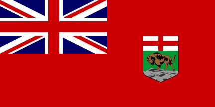
Algunos miembros del National Democratic Party (NDP) han expresado la necesidad de que la provincia canadiense de Manitoba adopte una nueva bandera, ya que la actual es un desfasado símbolo de los tiempos del colonialismo británico y además resulta dificil de distinguir de la de otra provincia, la de Ontario.
Time for a new Manitoba flag, say grassroots NDPers
Manitoba's provincial flag is an outdated symbol of British colonialism and needs to be changed, say some members of the NDP.They are putting forward a resolution calling for a new flag, to be debated at the provincial party's annual convention next month.
Sean Robert, the man behind the resolution, said the impetus is the need for a distinctive banner to better identify the province. Manitoba's flag is often confused with Ontario's flag, he said.
"There's very little difference between what we have and our fellow Canadians to the east of us have for a flag. So, we look almost exactly alike," said Robert, who represents the NDP's Riel constituency association in south Winnipeg.
"I really kind of feel it's almost like Ontario's a bit of a big brother, in terms of symbols. And really, I think we need our own independent symbol to really show what Manitoba's all about."
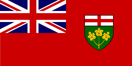
Both the Manitoba and Ontario flags resemble the Red Ensign used as Canada's flag prior to the creation and adoption of the present maple leaf design in 1965. Both flags feature the Union Jack in the upper left quarter and a shield with a coat of arms in the centre-right.
Even the shields are similar, topped by a red St. George's Cross and featuring a green background. The only difference is the Manitoba coat of arms contains a bison and the Ontario version has three golden maple leaves.
The upcoming convention is the perfect time to proudly assert Manitoba's identity, particularly as the province is one of the few regions of the country not buckling under the weight of the economic downturn, Robert said.
"This would be a really good chance [because] Manitoba's really now at the forefront of economic growth," he said.
19.5.08
La bandera del pueblo

Un artículo sobre la bandera oficiosa de la isla de Terranova.
‘The people’s flag’
Pink, White and Green to rise again
By KATIE HYSLOPSaturday, May 17, 2008
Victoria Day weekend marks the fourth anniversary of the raising of the Pink, White and Green on the Southside Hills — a tradition that began when Ryan Pugh was driving home from university and spotted a summit that needed a flag.
“I came to the intersection of Prince of Wales Street and LeMarchant Road,” says Pugh. “At that spot, looking across the harbour, (I had an) unobstructed view of the Southside Hills’ peak.
“I realized that this was one of St. John’s most visible locations and it existed as a blank slate … a flag was demanded.”
Pugh chose the Pink, White and Green because his family once thought they were related to its rumoured founder, Bishop Michael Fleming.
Fleming supposedly created the flag in 1843 as a sign of peace between feuding English and Irish sealers making a living hauling wood for churches and schools in St. John’s before the hunt.
Using his white handkerchief to tie the pink flag of the English and the green flag of the Irish together, he said the white was to honour his friend, William Carson of Scotland, who had recently died.
A 2003 article for The Independent by historian John Fitzgerald stated there is no evidence to support this tale. Its origins remain a mystery, but Fitzgerald traces the flag back 163 years.
“(The official flag) never really fancied me due to its garish angles and points,” says Pugh. “There is no lore to (Christopher) Pratt’s design and at least the Pink, White and Green has a story — even if the story is considered dubious by some.”
Pugh recruited three friends and over the long weekend they stitched their own nine- by-four-foot tri-colour flag and raised it on the Southside Hills.
Unfortunately, it was hard to see from across the harbour, so in 2005 they made a nine-by-15-foot flag and raised it 30 feet.
“The flag … could be seen from any clear vantage point in the St. John’s area,” says Pugh. “With the offices of The Independent on Harbour Drive, they couldn’t help but see the flag.
“Obviously it wasn’t a stretch for them to see the value in the flag: young Newfoundlanders fighting against the weather to plant a 15-foot handmade flag in a pile of rubble at the top of the Southside Hills.”
In 2006 The Independent financed the erection of a 30-foot custom steel flagpole at the site and has been raising the flag every May 24 weekend since.
The tri-colour flag is often associated with Newfoundland independence and secession from Canada. Living Planet, a local store that silksscreens its own clothing, uses the flag on several products, including a shirt with the caption Newfoundland Liberation Army.
Storeowner Dave Hopley says he doesn’t advocate the province separating from Canada, but views the flag as “the people’s flag.”
“Certainly most Newfoundlanders are proud of their heritage and it’s part of that,” he says. “The only caveat I have about the flag is I think some people think of it as a Townie flag … and I don’t really want to exclude rural Newfoundland from the sentiment.”
Pugh doesn’t support secession either and says while he prefers the tri-colour to the official flag, he would like to see a mix of the Pink, White and Green and the Labrador flag to represent the province.
“If the flag were adopted as is, it could be perceived as ignoring Labrador,” he says. “A lot of our province’s productivity comes out of the Big Land and to ignore that on the provincial flag would be an injustice.”
The Independent
20.12.07
Ontario necesita una nueva bandera
by Marcus Mayer, B.A., M.B.A.
After decades of flapping in the breeze, the current Ontario flag has become an outdated symbol for the 21st century. Our flag is a variation of the British ensign, the flag flown over colonies of the United Kingdom. Not only is it completely indistinguishable at a distance from Manitoba’s flag, Bermuda’s flag and Fiji’s Civil Ensign, but it is a constant reminder of a colonial relationship that simply no longer exists.
Long ago this was an accurate description of Ontario’s place in the world, when she was known as Upper Canada. However the sun has long set on the British Empire in North America. The Union Jack in the canton implies that Ontario’s allegiance ultimately lies with a foreign country thousands of miles away: Great Britain. The message to the rest of the world is that should the United Kingdom go to war, Ontario would unquestionably be obliged to follow suit. Ultimately through the symbolism carried by her flag, Ontario is globally relegated to a mere colonial status just like the Falkland Islands or Gibraltar. Is this really what we want Ontario to mean to the rest of the world?
Ontario prides herself on having one of the world’s most ethnically diverse cities on the planet, Toronto. Many of her other cities feature this same diversity. The Union Jack anachronistically flying above Ontario in an ever increasingly ethnically diverse province, sorely needs a change. When the fabric of Ontario is sewn from hundreds of different ethnicities, it is disrespectful to Ontarians to keep the Union Jack sewn on Ontario’s flag in 2007.
Why don’t we leave it up to the people of Ontario to design a great flag worthy of being flown all over Ontario? (Indeed, Canadians had chosen our current flag design, with the Maple Leaf, that was raised over Parliament Hill in 1965) I propose an immediate contest for Ontarians to redesign the Ontario flag, judged by the people of Ontario. After all, doesn’t the ultimate symbol of Ontario deserve to be representative of her people?