Un poco de humor a costa de la Vexilología:

Mostrando entradas con la etiqueta humor. Mostrar todas las entradas
Mostrando entradas con la etiqueta humor. Mostrar todas las entradas


27.3.09
¿Qué pasa con las banderas estatales que ondean errores de nuestros padres?
Un artículo satírico sobre el pobre diseño de la bandera de la mayoría de los estados de USA, a propósito de la propuesta de cambio de la bandera de Oklahoma.
The suggestion doesn't seem to be making him a lot of friends. "People ask me if there aren't more important things for me to work on," Jett told the Tulsa World. Lawmakers from Ponca City, the home of the current flag's designer, say they oppose any change. An editorial in the World insisted that the banner, unlike just about everything else in this vale of tears, "needs no improvement."
In fact, Oklahoma's symbol has something in common with most of the other 49 state flags: It could use a great deal of improvement. A lot more care goes into designing the basketball uniforms at big public universities than went into designing what flies over those schools.
The Oklahoma flag is one of many that seemingly were all created by the same designer on a rush order. They bring to mind Henry Ford's line that you could get a Model T in any color you wanted as long as it was black.
Like more than a dozen others, the flag is a variation on a humdrum theme: a blue background with something obscure, cluttered and gold in the center. If you climbed up a flagpole in Lansing and replaced the Michigan ensign with that of Louisiana, New York, Virginia or Nebraska, I promise, it would be months before anyone noticed.
Oklahoma stands out slightly more only because, like Montana, Oregon and Kansas, it prominently features the state name. Idaho goes them one better by doing it twice.
Given that most flags fly almost exclusively in their home state, including a name disparages the mental acuity of residents. It implies that without a prompt, some people would forget where they live.
On a distinctive, well-designed flag, the name is unnecessary. Imagine Old Glory with the name of the country prancing across it. Or Canada's maple leaf. Or Israel's Star of David.
The only good thing to be said about the popular blue-bedsheet style is that it assures a state flag will be forgettable instead of just plain homely. Maryland's clashing juxtaposition of black, gold, red and white shapes could have been used to extract information from Khalid Sheikh Mohammed. The image of George Washington on the Washington flag brings to mind a President's Day sale.
A good flag is clean, simple and distinctive. The experts at the North American Vexillological Association offer an excellent rule: A child should be able to draw it from memory.
For that, you can't beat Texas' tricolor with a white star or Alabama's red X on a white square. If the banner can evoke something about the place, even better—as with South Carolina's crescent moon over a palmetto tree, New Mexico's sun symbol, Arizona's starburst and Wyoming's buffalo.
The more a flag tries to do, the less likely it is to succeed. Illinois features a bald eagle perched on a boulder, which bears the dates 1818 and 1868. The bird grips a Stars and Stripes shield in one talon, and its beak holds a streamer proclaiming "State Sovereignty, National Union" (with "sovereignty" upside down). At its feet are what looks like palm fronds and shoots of grass, and behind it is a sun rising over a body of water. All these images congregate above the state name.
This is not a flag but a novel. It's got everything but Abraham Lincoln and Wrigley Field. Marilyn Vos Savant couldn't draw it from memory.
Surely we could do better. For most states, where the flag inspires only boredom, any change would be a good change. Well, almost any change: When Georgia got rid of a flag that included a Confederate symbol, the new model was voted worst in the country by NAVA. Two years later, the flag was replaced.
Georgia, however, deserves praise for trying to get it right. So does at least one guy in Oklahoma—I mean, OKLAHOMA!
What about state flags that fly mistakes of our fathers?
Shane Jett is an Oklahoma state representative with an idea that he says would raise his state's profile, bring in more tourists and enrich the local economy. He wants to change the state flag by italicizing the state's name and adding an exclamation point. Thus: OKLAHOMA!The suggestion doesn't seem to be making him a lot of friends. "People ask me if there aren't more important things for me to work on," Jett told the Tulsa World. Lawmakers from Ponca City, the home of the current flag's designer, say they oppose any change. An editorial in the World insisted that the banner, unlike just about everything else in this vale of tears, "needs no improvement."
In fact, Oklahoma's symbol has something in common with most of the other 49 state flags: It could use a great deal of improvement. A lot more care goes into designing the basketball uniforms at big public universities than went into designing what flies over those schools.
The Oklahoma flag is one of many that seemingly were all created by the same designer on a rush order. They bring to mind Henry Ford's line that you could get a Model T in any color you wanted as long as it was black.
Like more than a dozen others, the flag is a variation on a humdrum theme: a blue background with something obscure, cluttered and gold in the center. If you climbed up a flagpole in Lansing and replaced the Michigan ensign with that of Louisiana, New York, Virginia or Nebraska, I promise, it would be months before anyone noticed.
Oklahoma stands out slightly more only because, like Montana, Oregon and Kansas, it prominently features the state name. Idaho goes them one better by doing it twice.
Given that most flags fly almost exclusively in their home state, including a name disparages the mental acuity of residents. It implies that without a prompt, some people would forget where they live.
On a distinctive, well-designed flag, the name is unnecessary. Imagine Old Glory with the name of the country prancing across it. Or Canada's maple leaf. Or Israel's Star of David.
The only good thing to be said about the popular blue-bedsheet style is that it assures a state flag will be forgettable instead of just plain homely. Maryland's clashing juxtaposition of black, gold, red and white shapes could have been used to extract information from Khalid Sheikh Mohammed. The image of George Washington on the Washington flag brings to mind a President's Day sale.
A good flag is clean, simple and distinctive. The experts at the North American Vexillological Association offer an excellent rule: A child should be able to draw it from memory.
For that, you can't beat Texas' tricolor with a white star or Alabama's red X on a white square. If the banner can evoke something about the place, even better—as with South Carolina's crescent moon over a palmetto tree, New Mexico's sun symbol, Arizona's starburst and Wyoming's buffalo.
The more a flag tries to do, the less likely it is to succeed. Illinois features a bald eagle perched on a boulder, which bears the dates 1818 and 1868. The bird grips a Stars and Stripes shield in one talon, and its beak holds a streamer proclaiming "State Sovereignty, National Union" (with "sovereignty" upside down). At its feet are what looks like palm fronds and shoots of grass, and behind it is a sun rising over a body of water. All these images congregate above the state name.
This is not a flag but a novel. It's got everything but Abraham Lincoln and Wrigley Field. Marilyn Vos Savant couldn't draw it from memory.
Surely we could do better. For most states, where the flag inspires only boredom, any change would be a good change. Well, almost any change: When Georgia got rid of a flag that included a Confederate symbol, the new model was voted worst in the country by NAVA. Two years later, the flag was replaced.
Georgia, however, deserves praise for trying to get it right. So does at least one guy in Oklahoma—I mean, OKLAHOMA!
22.3.09
Banderas del mundo sustituidas por códigos
Hoy es un día histórico.
El Sistema Vexilográfico Internacional que filantrópicamente* ofrezco a la humanidad tiene la ventaja de permitir la identificación inmediata de la bandera de cualquier país. No importa su rareza o peso relativo en el contexto internacional.
Con el nuevo sistema, tan fácil se identifica la bandera de España como la de Bután. Incluso (¡ojo!) no es necesario haber visto anteriormente la bandera de Bután para decodificar que el pedazo de tela que flamea en lontananza corresponde a Bután.
Para ello dispondremos: Tabla de países ordenada demográficamente (para los próximos 25 años, tomaremos como referencia el censo de la ONU 2007) donde 1 = Ciudad del Vaticano y 197 = China Comunista**. Anotación en base 4 de aquellos números enteros x tal que x sea mayor que cero y menor de 198.
Recordamos fórmula de conversión base 10 a anotación base 4:
Ejemplo 196 = Rojo, Verde, Rojo, Amarillo = 0103 = India. A continuación el diseño de la bandera es tan mediato como asignar sobre un rectángulo dividido en cuatro columnas verticales el color (o no color -blanco- en el caso de casilla vacía) correspondiente a la anotación en base cuatro del escalafón demográfico.
De esta manera, con un fácil cálculo, cualquiera puede saber que la bandera que divisamos en lontananza (Verde, Verde, Rojo, Amarillo) corresponde al 1103, que equivale al país situado en el puesto 197 del ranking demográfico, a saber, la China Comunista. No hay confusión posible y en lugar de un mapa de colores basta tener a mano un sencillo y breve listado alfanumérico de aquellos países poblados reconocidos por la ONU para proceder a la desindexación. Hasta un niño puede hacerlo, evitándose de este modo engorrosos incidentes diplomáticos (recuérdese que no hay conflagración bélica que no se inicie con un incidente diplomático).
Según mis cálculos, con las plantas productoras a plena producción en junio de 2009 pueden sustituirse las banderas confeccionadas con el sistema obsoleto. Aunque para las administraciones de países latinos se aconseja un margen transitorio de hasta septiembre de 2009 (en prevención de los posibles cambios constitucionales).
A partir de esa fecha el nuevo sistema vexilográfico internacional será obligatorio.
* Al objeto de favorecer la rápida implantación del sistema en un momento económico tan delicado para la humanidad como el presente, la IA renuncia a las negociaciones de patente y marca a cambio de un módico royaltie de 0.12€ por estampación actualizable en función del IPC de la Confederación Helvética. Giro a 90 días. Creo que tamaña generosidad por mi parte puede dar idea cabal de mis filantrópicas intenciones.
** El sistema parte de la base del innecesario trazado de nuevas fronteras, por lo que cualquier intento secesionista sobre el actual queda pospuesto a la realización de un nuevo ranking demográfico, en 2034.
Luis Besa
4.10.08
Blog humorístico sobre banderas

"Bad flags" es un divertido blog en inglés dedicado a comentar con mucha ironía y gran sentido del humor todas aquellas banderas que no le gustan al autor, ya sea por su diseño, su simbolismo o cualquier otro motivo. No es recomendable para todas aquellas personas que crean que las banderas son símbolos venerables sobre los que no se puede bromear.
13.5.08
Los símbolos en mi bandera (y lo que significan)
Un divertido artículo que ironiza sobre los símbolos y su significado.
The symbols on my flag (and what they mean)
by Jack Handey
The bra and panties stand for women’s rights.
Davy Crockett shaking hands with Daniel Boone symbolizes how we need to put aside our differences.
The skull and crossbones, in the lower right corner, stands for pirates, and all that they have given us.
The angel holding the sword represents how guns are nice but swords are more of a “heavenly” thing.
The plow with the four-leaf clover symbolizes the luck of the farmer.
The quicksand represents the travails of life. The hand sticking out of it is so you know it’s quicksand and not just a dirty spot on the flag.
The bat stands for eternal life, through our lord Dracula.
The sheaf of wheat symbolizes the bounty of the land, and the hope that soon more things will come in sheaves.
The parrot represents the need to communicate, even if it’s only squawks.
The tin of paprika stands for paprika, a spice I hope to learn more about.
The triskelion indicates that I know what a triskelion is.
The sun on the horizon makes you wonder, Is it rising or setting? And is it our sun or a weird invader sun? The five rays coming out of the sun symbolize the five times that I have had sex.
The big word “NO” refers to the boy running with the pair of scissors. If you look closer, you can see that he also has a pair of scissors sticking in his thigh and another in his belly. This symbolizes the need for kids not to run with scissors, especially if they’ve already been stuck by scissors.
The bulldozer pushing over the pine tree stands for progress. And the bluebird flying out of the tree symbolizes the way bluebirds fly off when you knock down their trees.
The rose stands for blood. So does the sparkling ruby. And so does the bucket with “Blood” written on the side. All hail Dracula!
The eagle, you will note, is the centerpiece of my flag. It symbolizes freedom. Also the ability to see far away, so you can spot somebody doing something fishy and get him locked up.
In his talon, the eagle is holding a clutch of arrows. This symbolizes the growing problem of Indian litterbugs. Wrapped around the eagle’s other talon is a big ball of fishing line, which represents my love of fishing.
The banner in the eagle’s beak, if you can’t read it, says “Courage, Valor, Dignity, ANTS!!”
It’s easy to tell what some of the symbols on my flag mean. The tweezers symbolize tweezing. The dog symbolizes doggies. Good boy! Good doggie! But the meaning of other symbols is not so clear, even to me. What does the T. rex stepping on the Martian mean? Perhaps scholars can figure it out.
My flag started out as nothing more than the word “NO” on a blank background and has evolved over the years. Recently, my friend Don told me that my flag had too many symbols, that it was “cluttered.” I wanted to punch him, but instead I ran out into the howling storm, fell on my knees, and railed against the night. “Why me, Lord?” I sobbed. “Why me?” Then I saw my flag, illuminated by my spotlight and my rotating Christmas color wheel, flying proudly above the tool shed. As the flag snapped in the wind, some of my symbols, which I guess I hadn’t sewn on too well, flew off like leaves. There were also some real leaves blowing by, but mostly it was symbols. And I thought, Maybe Don’s right. Maybe I do need to “thin out” my flag. So I wound up removing some of the symbols, leaving only the ones you see here today. If it’s still “cluttered,” then so be it. I would rather have a cluttered flag than one that has no meaning whatsoever.
The New Yorker
The symbols on my flag (and what they mean)
by Jack Handey
The bra and panties stand for women’s rights.
Davy Crockett shaking hands with Daniel Boone symbolizes how we need to put aside our differences.
The skull and crossbones, in the lower right corner, stands for pirates, and all that they have given us.
The angel holding the sword represents how guns are nice but swords are more of a “heavenly” thing.
The plow with the four-leaf clover symbolizes the luck of the farmer.
The quicksand represents the travails of life. The hand sticking out of it is so you know it’s quicksand and not just a dirty spot on the flag.
The bat stands for eternal life, through our lord Dracula.
The sheaf of wheat symbolizes the bounty of the land, and the hope that soon more things will come in sheaves.
The parrot represents the need to communicate, even if it’s only squawks.
The tin of paprika stands for paprika, a spice I hope to learn more about.
The triskelion indicates that I know what a triskelion is.
The sun on the horizon makes you wonder, Is it rising or setting? And is it our sun or a weird invader sun? The five rays coming out of the sun symbolize the five times that I have had sex.
The big word “NO” refers to the boy running with the pair of scissors. If you look closer, you can see that he also has a pair of scissors sticking in his thigh and another in his belly. This symbolizes the need for kids not to run with scissors, especially if they’ve already been stuck by scissors.
The bulldozer pushing over the pine tree stands for progress. And the bluebird flying out of the tree symbolizes the way bluebirds fly off when you knock down their trees.
The rose stands for blood. So does the sparkling ruby. And so does the bucket with “Blood” written on the side. All hail Dracula!
The eagle, you will note, is the centerpiece of my flag. It symbolizes freedom. Also the ability to see far away, so you can spot somebody doing something fishy and get him locked up.
In his talon, the eagle is holding a clutch of arrows. This symbolizes the growing problem of Indian litterbugs. Wrapped around the eagle’s other talon is a big ball of fishing line, which represents my love of fishing.
The banner in the eagle’s beak, if you can’t read it, says “Courage, Valor, Dignity, ANTS!!”
It’s easy to tell what some of the symbols on my flag mean. The tweezers symbolize tweezing. The dog symbolizes doggies. Good boy! Good doggie! But the meaning of other symbols is not so clear, even to me. What does the T. rex stepping on the Martian mean? Perhaps scholars can figure it out.
My flag started out as nothing more than the word “NO” on a blank background and has evolved over the years. Recently, my friend Don told me that my flag had too many symbols, that it was “cluttered.” I wanted to punch him, but instead I ran out into the howling storm, fell on my knees, and railed against the night. “Why me, Lord?” I sobbed. “Why me?” Then I saw my flag, illuminated by my spotlight and my rotating Christmas color wheel, flying proudly above the tool shed. As the flag snapped in the wind, some of my symbols, which I guess I hadn’t sewn on too well, flew off like leaves. There were also some real leaves blowing by, but mostly it was symbols. And I thought, Maybe Don’s right. Maybe I do need to “thin out” my flag. So I wound up removing some of the symbols, leaving only the ones you see here today. If it’s still “cluttered,” then so be it. I would rather have a cluttered flag than one that has no meaning whatsoever.
The New Yorker
25.10.07
Por una bandera ibérica
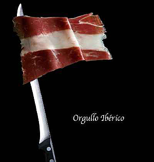 Ahora que la polémica de la bandera está de plena actualidad, hay quien ha lanzado, a través de la Red, una elocuente propuesta en forma de imagen que bien podría ser una foto de Chema Madoz. Ni senyera, ni ikurriña, ni rojigualda: Jamón ibérico, la auténtica enseña nacional y lo que mejor representa nuestra identidad. ¿Hay algo más español?
Ante la pata negra, nadie enarbola conceptos como hecho diferencial, pluralidad lingüística o derecho histórico. Ahí no hay división. No existe ideología que no venere, e incluso se emocione, ante una ración del veteado oro graso. ¿Quien preferiría cambiarlo por la butifarra, el fuet o el chóped?
Los internautas, cansados de tanta crispación, han encontrado el verdadero símbolo de la unidad de España —sacado de una campaña publicitaria— en un fino corte de jamón curado. En la imagen, aparece adosado a un afilado mástil. Aunque, tal y como anda la precampaña, mejor no poner un cuchillo jamonero al alcance de ningún político.
Suscribirse a:
Entradas (Atom)